Why Must Pattern Be Considered When Selecting a Shirt?
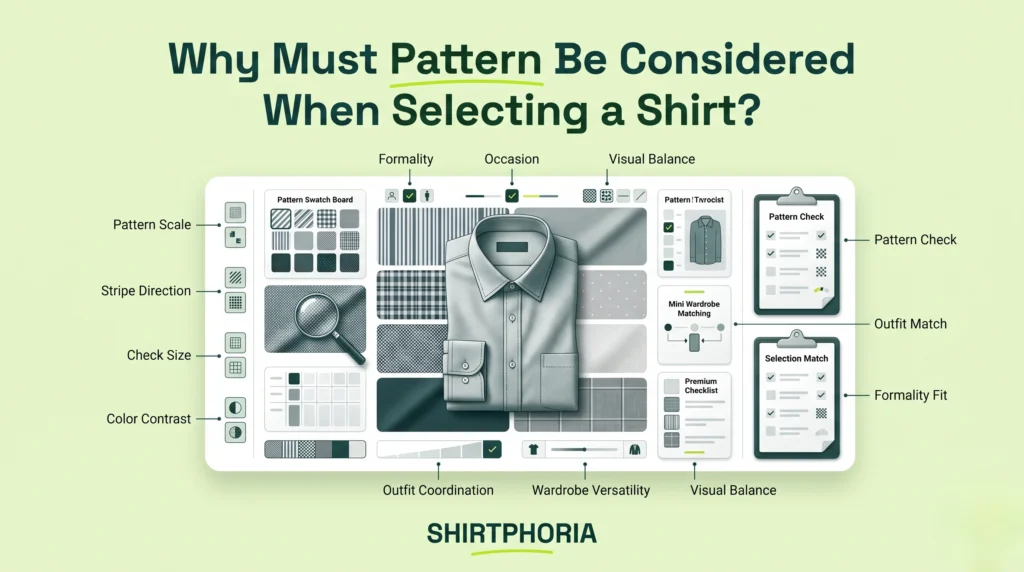
Shirt pattern should guide your style decision because pattern scale, contrast, spacing, and motif type can influence visual weight, formality, focal attention, and body proportion.
Choosing the wrong pattern scale or motif can weaken an otherwise well-fitted outfit by creating visual confusion, clashing with the dress code, or pulling attention away from the wearer’s face. A shirt pattern is not only decoration. It is a visual signal that affects whether the shirt feels formal, relaxed, expressive, conservative, sharp, or visually heavy.
This guide explains why shirt pattern affects formality, what core patterns communicate, how to choose pattern scale based on body frame, how to match patterns with ties and jackets, and which visual mistakes to avoid.
Shirt pattern is the repeated visual design on a shirt, such as stripes, checks, plaids, dots, florals, or geometric motifs, that changes how the garment communicates formality, movement, and visual weight.
Pattern scale describes the physical size of the repeated design, from micro-patterns and fine stripes to large plaids, bold florals, and oversized motifs.
Visual weight is the amount of attention a shirt pattern attracts because of its size, contrast, spacing, color intensity, and repetition.
A strong shirt pattern guide should separate shirt pattern from shirt color, pattern scale from pattern type, and personal taste from dress-code suitability. The best patterned shirt is not always the loudest or safest one. It is the one whose scale, contrast, spacing, and motif support the wearer, the outfit, and the setting.
Why Does Shirt Pattern Influence Visual Weight and Formality?
Shirt pattern influences visual weight and formality because the eye reacts to contrast, spacing, repetition, and scale before it evaluates the rest of the outfit.
A low-contrast pencil stripe can sit quietly under a jacket. A large plaid can dominate the torso. A bold floral motif can turn the shirt into the main focal point. These effects are not universal laws, but they are useful practical signals when choosing a patterned shirt for business, smart-casual, casual, or creative settings.
How Shirt Pattern Controls Attention and Body Proportion
Shirt patterns can guide the viewer’s eye through lines, spacing, contrast, and motif repetition, which may influence how the wearer’s proportions are visually read.
Shirt pattern guides visual attention by creating direction. Vertical stripes may draw the eye up and down. Large checks, plaids, and wide motifs can add horizontal visual weight. Dense repetition can make the surface of the shirt feel busy, while lower-contrast spacing can make the pattern feel calmer.
A fine vertical stripe may create a longer visual line, especially when narrow, low-contrast, and well-spaced. A large high-contrast check can add visual width across the chest depending on scale, spacing, fit, and body frame.
These are practical styling tendencies, not guaranteed body-shape effects. Pattern effect varies by garment fit, contrast, lighting, pattern spacing, body frame, and outfit context.
How Shirt Pattern Scale Affects Dress Code Suitability
The scale of a shirt pattern can affect dress-code suitability because smaller, lower-contrast patterns usually feel more restrained, while larger, high-contrast patterns often feel more casual or expressive.
A formality signal is the visual message a shirt sends about whether it belongs in a formal, business, smart-casual, casual, or creative setting.
Formal and corporate settings often favor solid shirts or subtle patterns because they create less visual noise. Business-casual settings usually allow more flexibility, including micro-gingham, pencil stripes, small checks, and restrained dots. Casual and creative settings can support larger plaids, bolder florals, paisley motifs, geometric motifs, and stronger contrast when the rest of the outfit is balanced.
Practical menswear guidance from The Tie Bar treats subtle dress-shirt patterns as easier to use in business or polished settings, while bolder patterns usually fit more relaxed or expressive outfits: Types of Men’s Dress Shirt Patterns & When to Wear Them.
A micro-gingham shirt may work in a smart-casual office. A large buffalo plaid shirt usually belongs in casual or rugged weekend styling. Dress-code suitability still depends on pattern scale, contrast, color, fabric, styling, and the specific setting.
Before choosing a patterned shirt, readers should understand how shirt pattern selection explains visual design, styling intent, fabric considerations, and cultural context.
What Core Shirt Patterns Define Styling Intent and Formality?
Core shirt patterns define styling intent by communicating different levels of formality, with stripes usually reading cleaner and more professional, checks adding relaxed structure, and expressive motifs creating stronger personality.
A shirt pattern should be chosen for the message it sends. Stripes create direction. Checks create structure. Plaids create casual weight. Florals, paisleys, polka dots, and geometric motifs create stronger focal attention. The safest pattern is not always the best choice. The right pattern depends on the setting, the wearer’s frame, and how the shirt will coordinate with the rest of the outfit.
How Striped Shirt Patterns Add Vertical Direction and Professional Restraint
Striped shirt patterns, especially fine or closely spaced vertical stripes, can add vertical direction and professional restraint without overwhelming a tailored outfit.
Thin, closely spaced stripes usually work better for business settings because they add movement without becoming loud. Wider, high-contrast stripes often feel more casual or statement-driven, especially when paired with plain trousers or a relaxed jacket.
A fine blue pencil-stripe shirt can pair well with a navy suit because it adds subtle vertical movement from a distance. A pinstripe or pencil stripe can also help a shirt feel sharper than a plain casual button-up without becoming visually dominant.
Best for:
- Business professional outfits.
- Conservative office settings.
- Shorter frames seeking a longer visual line.
- Broader frames wanting a cleaner vertical direction.
Avoid if:
- The stripe contrast is too bold for the dress code.
- The accompanying tie or jacket features a very similar stripe scale.
- The shirt will be filmed and the stripe pattern is extremely tight and high-contrast.
How Checked Shirt Patterns Add Texture, Width, and Casual Energy
Checked shirt patterns, from micro-gingham to windowpane and plaid, can add texture, visual width, and casual energy because they create movement both vertically and horizontally.
The scale rule is simple: smaller, lower-contrast checks usually work better in smart-casual office environments, while larger, high-contrast plaids are usually safer for casual wear. Gingham, micro-gingham, and small checks can feel clean and approachable. Windowpane can add structure. Plaid and tartan often create stronger seasonal or rugged visual weight.
A small blue gingham shirt may transition into a relaxed office. A red tartan flannel is usually better for rugged weekend styling. Neither rule is absolute, but the pattern scale and contrast should match the setting.
Best for:
- Smart-casual outfits and relaxed office wear.
- Layering under plain solid jackets.
- Casual weekend styling and seasonal outfits.
Avoid if:
- The check scale overwhelms your frame.
- You are already wearing a heavily patterned tie or jacket.
- The dress code requires high formality.
How Floral, Paisley, and Geometric Motifs Express Creative Style
Illustrative motifs such as florals, paisleys, polka dots, and abstract geometrics can make a shirt feel more creative, expressive, and visually dominant.
A floral motif, paisley motif, geometric motif, or polka dot pattern should usually be treated as the main visual focus of the outfit. The more illustrative, colorful, or high-contrast the motif becomes, the more the rest of the outfit should act as a neutral backdrop.
A dark, subtle floral camp-collar shirt can work as a summer evening statement piece when anchored by plain trousers. A bold paisley shirt may work in a creative casual outfit, but it can feel too expressive for conservative business settings.
Best for:
- Vacations and resort wear.
- Creative casual outfits and summer social events.
- Statement-driven styling.
Avoid if:
- The rest of the outfit is already visually loud.
- The dress code requires conservative restraint.
- The motif scale overwhelms your body frame.
How Do You Choose the Right Shirt Pattern Scale for Your Body Frame?
Choosing the right shirt pattern scale for your body frame means matching the visual size of the print to your physical proportions so the shirt supports your frame instead of overwhelming it.
Pattern scale can influence how the eye reads proportion, but the effect depends on the whole outfit. Fit, color contrast, fabric texture, shirt length, trouser choice, jacket shape, and lighting all matter. Body-frame guidance should be used as a mirror-check tool, not as a fixed rule.
How to Choose Shirt Pattern Scale for a Smaller or Shorter Frame
If you have a smaller or shorter frame, small to medium pattern scales often work better because oversized motifs may dominate the shirt depending on contrast, spacing, fit, and outfit context.
Oversized plaids, large florals, or massive repeated motifs may overpower a smaller torso when contrast is high or spacing is wide. Low-contrast patterns, fine stripes, micro-checks, and small gingham usually create a cleaner effect because they add interest without taking over the body.
Best choices:
- Micro-checks.
- Thin stripes.
- Small gingham.
- Subtle dots.
- Low-contrast prints.
Avoid:
- Oversized plaids when contrast is high.
- Large florals that dominate the shirt.
- Wide horizontal checks that add too much visual width.
- Massive repeated motifs with little negative space.
How to Choose Shirt Pattern Scale for a Taller or Broader Frame
Taller or broader frames often have enough surface area to support medium pattern scales without the motif looking crowded or disproportionate.
A medium stripe, windowpane, larger gingham, or balanced plaid may look natural on a larger shirt surface. Very tiny high-contrast micro-patterns can sometimes create visual buzzing or look too busy across a broad chest, especially when the pattern repeats tightly.
Best choices:
- Medium stripes.
- Windowpane checks.
- Larger gingham.
- Medium plaids.
- Balanced geometric motifs.
Avoid:
- Tiny high-contrast grids.
- Micro-patterns that create visual noise.
- Patterns so small that they disappear from normal viewing distance.
How to Choose Shirt Pattern Scale for a Lean Frame
Lean frames can use medium checks, balanced stripes, and moderate contrast patterns to add controlled visual weight and structure to the torso.
A lean frame may benefit from patterns that create visual presence without overwhelming the body. Medium gingham, balanced plaid, slightly wider stripes, and soft-contrast checks can add structure while still looking intentional.
Best choices:
- Medium gingham.
- Balanced plaid.
- Slightly wider stripes.
- Soft-contrast checks.
Avoid:
- Extremely tiny prints that disappear visually.
- Huge motifs that overpower a narrow torso.
- High-contrast patterns that dominate the whole outfit.
How to Choose Shirt Pattern Scale for a Fuller or Heavier Frame
Fuller frames often look cleaner in fine vertical stripes or lower-contrast patterns because these choices can reduce visual noise and avoid adding extra visual width.
Bold horizontal lines or large high-contrast checks can draw the eye outward and add visual width, especially across the chest. This does not mean checks always make the wearer look wider. Scale, contrast, spacing, shirt fit, and outfit balance determine the result.
Best choices:
- Fine vertical stripes.
- Low-contrast micro-checks.
- Darker patterned shirts.
- Patterns with clear vertical movement.
Avoid:
- Large high-contrast plaids.
- Wide horizontal pattern blocks.
- Bright oversized motifs across the chest.
- Tight high-contrast grids if the shirt will be filmed.
How Do Different Shirt Patterns Compare by Formality, Scale, and Body Effect?
Comparing different shirt patterns reveals how specific designs can support formal refinement, body-elongating visual lines, casual texture, or stronger focal attention.
The body effect column below describes common visual tendencies, not guaranteed outcomes. A solid shirt, pinstripe, pencil stripe, micro-gingham, windowpane, tartan, floral motif, or polka dot can change depending on scale, contrast, color, fabric, shirt fit, and outfit context.
Shirt Pattern Comparison Matrix
| Pattern Type | Formality Level | Common Visual Effect | Ideal Occasion | Best Suited Frame |
|---|---|---|---|---|
| Solid | Highest / Most Restrained | Neutral; dark colors may look more visually compact | Formal events, strict business, conservative office | All body types |
| Pinstripe | High | May create a longer vertical line | Business professional, dress shirts | Shorter or broader frames |
| Pencil Stripe | High | Subtle vertical direction | Office wear, business casual | Most body types |
| Micro-Gingham | Medium | Adds controlled texture and slight width | Smart-casual office, relaxed business | Smaller to medium frames |
| Windowpane | Medium-Low | Adds structure and visual width | Smart-casual, layered outfits | Taller or broader frames |
| Tartan / Plaid | Low | Often broadening and visually heavier | Casual, outdoors, weekend wear | Taller or leaner frames |
| Bold Floral | Lowest | Draws strong focal attention | Vacations, creative casual, summer events | Best styled as a statement piece |
| Polka Dot / Small Motif | Medium | Adds controlled personality | Smart-casual, creative office | Small to medium frames |
How Does Shirt Pattern Scale Change Visual Effect?
The scale of a shirt pattern can change its visual effect, influencing whether the shirt blends into a professional background or draws attention in a casual setting.
Pattern scale does not produce guaranteed body-shape outcomes. It changes the way the eye reads the shirt. Micro-patterns can feel subtle. Medium patterns can feel balanced. Large patterns can feel bold. High-contrast patterns can become focal points. Low-contrast patterns are usually easier to style.
Pattern Scale Decision Matrix
| Pattern Scale | Visual Effect | Best Use | Avoid When |
|---|---|---|---|
| Micro Pattern | Subtle, refined, low visual noise | Business, conservative office, layering under jackets | You want a bold statement or the pattern is tight and high-contrast on camera |
| Small Pattern | Controlled interest without overpowering | Smart-casual, office casual, smaller frames | The pattern is too high contrast on camera |
| Medium Pattern | Balanced visibility and personality | Casual office, relaxed social wear, most frames | Strict formal settings |
| Large Pattern | Bold, casual, visually dominant | Weekend wear, creative outfits, statement shirts | Formal events or when it dominates a smaller frame |
| High-Contrast Pattern | Strong visual energy and attention | Casual looks, fashion-forward styling | Conservative dress codes, video calls, already busy outfits |
| Low-Contrast Pattern | Softer and easier to style | Business casual, subtle outfits, layering | You need the shirt to act as the main statement piece |
Decision rules:
- Choose micro or small patterns for formal and business settings when the contrast is controlled.
- Choose medium patterns for balanced smart-casual wear.
- Choose large patterns for casual or creative outfits.
- Choose low-contrast patterns when you want versatility.
- Choose high-contrast patterns only when the shirt is meant to be the focal point.
- Avoid tight high-contrast micro-patterns when the shirt will be filmed or photographed.
How Do You Match Shirt Patterns with Ties, Jackets, and Trousers?
Matching a patterned shirt with ties, jackets, and trousers requires scale variation so the outfit looks cohesive rather than visually chaotic.
Pattern matching works best when every item has a clear role. One piece should lead. The other pieces should support. When the shirt, tie, jacket, and trousers all compete for focal attention, the outfit becomes harder to read.
How to Match a Patterned Shirt with a Tie
When matching a patterned shirt with a tie, vary the scale between the two patterns so they do not fight for visual dominance.
If a shirt and tie have identical stripe widths or check sizes, the eye may struggle to separate them. The outfit may look busy even when the colors technically match. Scale variation creates hierarchy.
A narrow striped shirt can pair with a wider striped tie, a larger dotted tie, or a solid tie. A micro-check shirt can work with a larger dot tie because the patterns are visually different enough to avoid direct competition.
Safe pairings:
- Fine stripe shirt + solid tie.
- Micro-check shirt + larger dot tie.
- Small gingham shirt + plain knit tie.
- Low-contrast patterned shirt + stronger but larger-scale tie.
How to Match a Patterned Shirt with a Jacket
To layer a patterned shirt under a jacket without making the outfit too busy, let only one item carry the dominant pattern.
If the shirt features a bold floral, heavy check, strong paisley, or loud geometric motif, keep the jacket solid. If the jacket is a bold plaid or heavy tweed, keep the shirt subtle or solid. This creates a controlled focal point.
A patterned camp-collar shirt can work under a plain navy linen jacket, but it may clash under a loud checked blazer. A micro-pattern shirt can sit under a textured solid jacket because the scale difference is clear.
How to Match a Patterned Shirt with Trousers
Trousers should usually act as a stabilizing anchor for patterned shirts, making plain solid-color trousers the safest and cleanest choice.
Trousers occupy a large amount of visual space. Pairing a loud patterned shirt with patterned trousers can overload the outfit, especially when both pieces use high contrast. Plain trousers allow the shirt pattern to remain intentional rather than accidental.
A bold patterned summer shirt often looks cleaner with plain navy, white, beige, olive, or charcoal trousers. A subtle striped shirt can also work with textured trousers if the contrast remains controlled.
What Shirt Pattern Matching Mistakes Should You Avoid?
Avoiding common pattern matching mistakes, such as ignoring scale variation, wearing busy prints on camera, or choosing overly casual patterns for formal events, helps prevent visual confusion and dress-code mismatch.
A patterned shirt can fail in several ways. It can be too subtle to serve its purpose. It can be too loud for the dress code. It can clash with the tie or jacket. It can add unwanted visual width. It can also look unstable on camera when the pattern is extremely tight and high contrast.
How to Prevent Clashing Shirt Patterns with Ties and Suits
Wearing a patterned shirt with a tie or jacket that uses nearly identical pattern scale often creates a visually busy clash.
Why it fails: Similar pattern sizes can fight for dominance and make the outfit harder to read. A thin striped shirt with a nearly identical thin striped tie may create visual competition instead of harmony.
Fix: Force scale variation. Pair a micro-patterned shirt with a larger-scale tie pattern, or keep one piece solid. The clearer the scale difference, the easier the outfit becomes to understand.
How to Avoid the Optical Illusion Trap of Busy Prints
Tight, high-contrast repetitive patterns may create visual buzzing or moiré effects on video calls, photography, or under certain lighting and display conditions.
The moiré effect is a visual artifact that can appear when tight repetitive patterns interact poorly with a camera sensor or digital display.
Why it fails: Digital cameras may struggle with fine repetitive patterns when the pattern spacing interacts poorly with the camera sensor or display. Photography Life explains that moiré can occur when fine repeating details interfere with camera capture or digital display behavior: What Is Moiré and How It Can Ruin Your Photos.
This does not mean micro-patterns always cause moiré. The risk depends on pattern tightness, contrast, camera sensor, lighting, distance, and display context.
Fix: If the shirt will be photographed or filmed, choose a solid shirt, low-contrast pattern, or pattern with wider spacing.
How to Avoid Wearing Overly Casual Shirt Patterns in Formal Settings
Bold plaids, tropical florals, and oversized checks can feel inappropriate in conservative business or formal settings because they usually create more visual energy than the dress code allows.
Why it fails: Large, colorful, or highly expressive patterns often reduce the perceived formality of a shirt. They can look intentional in casual or creative outfits, but they may feel mismatched in conservative business environments or formal events.
Fix: Reserve solids, fine pencil stripes, and very subtle micro-checks for formal events or conservative business environments. Use larger plaids, tropical florals, and expressive motifs in casual, vacation, weekend, or creative settings.
Good vs Bad Shirt Pattern Pairing
| Bad Pattern Choice | Why It Fails | Better Choice |
|---|---|---|
| Shirt and tie have the same stripe width | Creates visual competition | Vary pattern scale clearly, such as thin stripe shirt + wider stripe tie |
| Large plaid in a formal office | Feels too casual and visually heavy | Micro-check, fine stripe, or solid shirt |
| Tiny high-contrast pattern on camera | May create visual buzzing or moiré effect | Solid, low-contrast, or wider-spaced pattern |
| Bold floral shirt with loud checked jacket | Creates too many competing focal points | Keep either the shirt or jacket simple |
| Oversized print on a smaller body frame | Can overwhelm body proportions | Choose small to medium pattern scales |
| High-contrast check with patterned trousers | Overloads the outfit visually | Use plain solid trousers |
| Bold patterned shirt with loud tie | Splits focal attention | Use a solid tie or larger/smaller scale contrast |
What Shirt Pattern Diagnostic Tests Should You Use Before Buying?
Before buying a patterned shirt, test the pattern’s scale, contrast, formality, outfit pairing, and camera suitability so the shirt works in real wardrobe conditions.
Every pattern test should include a pass, warning, and fail signal. A pass means the pattern supports the setting and outfit. A warning means the pattern may still work but needs caution. A fail means the pattern is likely mismatched for the intended use.
Shirt Pattern Diagnostic Pass / Warning / Fail Table
| Pattern Test | Pass | Warning | Fail |
|---|---|---|---|
| Dress Code Test | Pattern suits the setting | Pattern is slightly expressive | Pattern feels clearly too casual or too loud |
| Scale Test | Pattern scale matches body frame | Pattern is slightly small or large | Pattern overwhelms the frame or disappears visually |
| Contrast Test | Contrast supports the outfit | Contrast is strong but manageable | Contrast dominates the entire outfit |
| Tie Pairing Test | Shirt and tie scales are clearly different | Scales are close but not identical | Shirt and tie pattern scales visually clash |
| Jacket Pairing Test | One dominant pattern controls the outfit | Shirt and jacket both have visible pattern | Shirt and jacket compete equally for attention |
| Trouser Balance Test | Trousers stabilize the patterned shirt | Trousers have subtle texture | Shirt and trousers both feel visually busy |
| Camera Test | Pattern looks stable on camera | Pattern shows slight visual buzzing | Pattern creates obvious moiré or distraction |
| Body Proportion Test | Pattern supports the wearer’s frame | Pattern slightly changes visual balance | Pattern adds unwanted width or overwhelms proportions |
| Focal Attention Test | Shirt has a clear role in the outfit | Shirt competes mildly with other pieces | Multiple pieces fight for attention |
One warning signal does not always mean failure. A slightly expressive shirt pattern may still work if the rest of the outfit is quiet. A medium check may suit a casual office even if it is not ideal for a strict business setting.
Multiple warnings usually indicate weak pattern selection. Any fail signal involving dress code, scale, or camera suitability should make the buyer reconsider the shirt before purchase.
What Shirt Pattern Selection Checklist Ensures a Better Purchase?
A shirt pattern selection checklist helps create better purchases by forcing you to evaluate dress code suitability, body proportion, pattern scale, and outfit coordination before buying.
The goal is not to remove personality from patterned shirts. The goal is to make sure the pattern supports the wearer, the outfit, and the setting.
What Shirt Pattern Selection Checklist Ensures a Better Purchase?
A shirt pattern selection checklist helps create better purchases by forcing you to evaluate dress code suitability, body proportion, pattern scale, and outfit coordination before buying.
The goal is not to remove personality from patterned shirts. The goal is to make sure the pattern supports the wearer, the outfit, and the setting.
The Pre-Purchase Pattern Checklist
Frequently Asked Questions
Shirt pattern matters because scale, contrast, spacing, and motif type influence formality, focal attention, visual weight, and how well the shirt supports the occasion.
Solid shirts, fine stripes, pencil stripes, micro-gingham, and low-contrast small checks are usually safest for business settings because they add less visual noise.
Choose a pattern scale that supports your frame. Smaller or shorter frames often benefit from small to medium patterns, while taller or broader frames can usually carry medium scales more easily.
Yes, but the shirt and tie should use different pattern scales. A fine striped shirt can work with a solid tie, larger dot tie, or wider stripe tie when the scale difference is clear.
Avoid tight, high-contrast micro-patterns when filming or joining video calls because they may create visual buzzing or moiré effects depending on camera and display conditions.
Terms Explained
| TERM | DEFINITION |
|---|---|
| Shirt Pattern | The repeated visual design on a shirt, such as stripes, checks, plaids, dots, florals, or geometric motifs. |
| Pattern Scale | The physical size of the repeated design, from micro-patterns to oversized motifs. |
| Visual Weight | The amount of attention a shirt pattern attracts through scale, contrast, spacing, color intensity, and repetition. |
| Formality Signal | The visual message a shirt sends about whether it belongs in formal, business, smart-casual, casual, or creative settings. |
| Micro-Gingham | A small check pattern that can add controlled texture while remaining useful in smart-casual or relaxed business contexts. |
| Windowpane | A larger open check pattern that adds structure and can create visual width. |
| Moiré Effect | A visual artifact that can appear when tight repetitive patterns interact poorly with a camera sensor or digital display. |
| Scale Variation | The practice of combining patterns with clearly different sizes so the outfit has visual hierarchy instead of conflict. |
Conclusion
In conclusion, understanding why shirt pattern matters means recognizing that visual design is not merely decoration, but a practical styling tool that can influence formality, visual weight, body proportion, and outfit coordination.
Scale, contrast, spacing, and motif type can change how the eye reads the wearer’s silhouette and outfit intent. A fine stripe may create quiet professional direction. A micro-gingham shirt may add smart-casual texture. A large plaid may feel relaxed and visually heavy. A bold floral motif may become the main focal point of a creative outfit.
By choosing pattern scale carefully and avoiding visual clashing, consumers can make patterned shirts look intentional instead of accidental. The best shirt pattern selection process checks dress code, body frame, tie pairing, jacket pairing, trouser balance, and camera use before the shirt enters the wardrobe.
By mastering pattern scale, contrast, and outfit pairing, you can select patterned shirts that look intentional, proportional, and appropriate for the setting.